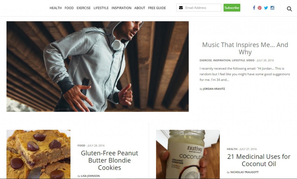
When it comes to creating and managing your website in today’s challenging market, remember to think about your user. UX (user experience) plays a crucial role in the success of your online business and it has the potential to be the most powerful asset in increasing traffic and user engagement with your brand.
On the contrary, if users are not interacting with your website they will likely not be engaged with your content or brand. Starting to worry about your site’s UX? Don’t fear, we’ve put a list together of ways you can improve the user experience on your website. Follow these steps to success!

Page Load Speed
A website’s page load time is one of the most important factors when it comes to poor user experience. The longer a visitor waits for a page to load, the bigger an opportunity you give them to leave and look elsewhere. You don’t want this to be their first impression. A few things you can do to increase your site’s page load speed are activate browser caching, optimize your images and limit the number of plugins on your site.
Content
Content is king! A content-rich website can increase user satisfaction, customer acquisitions and it will certainly keep your visitors coming back for more. You can have the best looking website in the world but if the content is sub-par you won’t engage with your user.
Now the question is how to make your content interactive? Tell a story about yourself or your business. Find a way to set yourself apart from competitors and make sure captivate your audience.
Well Designed Heading
A well designed heading adds to a site’s value in terms of visibility and engaging a user. It’s the first thing the user will see when visiting your website. Three things to remember:
- Be clear and concise about what is you do or what your business offers. The copy in your header should get right to the point and remember to avoid using confusing jargon.
- Use imagery or video to engage your visitor and draw them in.
- Make sure to always mention your brand or company in the header. Maybe that’s your company logo or your blog name, whatever it is make sure it’s front and center.
Definitive Call to Action
A call to action is an instruction for your visitors to do something; buy this, sign up here, start today. This helps with converting your user into a customer or making a casual reader into a subscriber to your blog.
Clean and Robust Design
Designing your website to suit the user’s psychology further improves the UX of your site. An interactive website design includes an elegant navigation menu, easily located navigation buttons, search bar, header and footer. Apart from the navigation menu, the fonts, colors and graphics should be chosen wisely for a responsive and appealing look.
Implement A Search Bar
An internal site search engine is another way to improve your user experience. Users can now easily find a desired product or specific content, and the website owner can gather useful information about the behavior of their users.
Responsive and Mobile Friendly Design
Today, advanced web browsing capabilities of smartphones and tablets are keeping users away from their desktops and laptops. This has made the development of responsive websites essential. A responsive web design provides optimal viewing experience across a wide range of devices.
Creating a responsive and mobile-friendly website not only improves your user experience, but also improves your website’s visibility in organic search. Google is penalizing sites that are not mobile optimized, so making your website responsive has become even more crucial.
Integrate Social Media Platforms
Social media platforms have changed the marketing landscape for all businesses everywhere. User engagement and product feedback or promotion can now reach a completely new audience and it’s done organically. If a user likes your content or products they’re able to share it instantly, with the click of a button.

